A Painter's Palette: Understanding the Emotional Impact of Color Selection with Ackermann's Experts Jun 12, 2026
The journey begins with acknowledging that colors are more than mere aesthetic choices. They evoke emotions, influence moods, and can even impact our decision-making processes. For instance, consider how a bold red might energize a room while a soft blue can create a calming oasis. Understanding these nuances can help you achieve the desired emotional effect in your space, whether it’s adding warmth to a cozy den or creating serenity in a spa-like bathroom.
Ackermann’s painting professionals draw on their extensive experience to help clients select the right palette. By sharing insights into which colors complement each other and how certain hues can affect the ambiance, we empower you to make informed decisions. Acknowledging the context is also vital; lighting, the room's purpose, and personal preferences play significant roles in determining what will work best.
Warm colors like red, orange, and yellow are known to stimulate and invigorate. These energetic hues can be ideal for social spaces such as living rooms or kitchens, where lively conversations and activity occur. The intensity of these colors often brings vibrancy to a room, encouraging engagement and creativity. However, tempering these bright hues with accents or mixing them with cooler colors can ensure they aren't overwhelming.
On the cooler end of the spectrum, blues, greens, and purples contribute to creating a tranquil and peaceful environment. Perfect for bedrooms or bathrooms, these colors promote relaxation and calmness. Their understated elegance adds a soothing backdrop that can help in unwinding after a long day. Ackermann’s experts recommend pairing these cooler tones with neutral shades or soft pastels to enhance their calming effect.
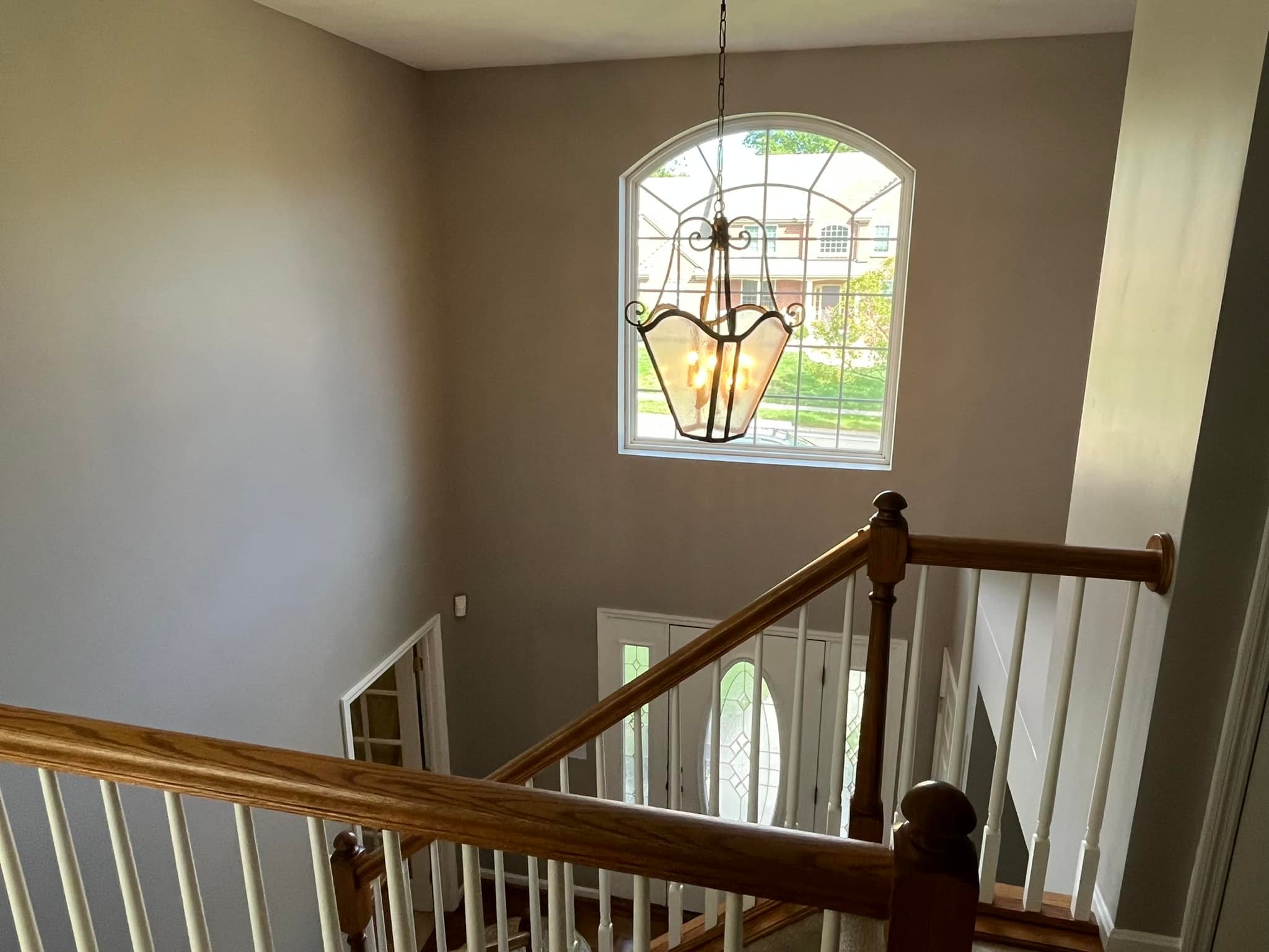
The paint selection also doesn't end at primary colors. Neutral colors, such as beige and gray, offer balance and versatility, serving as a perfect backdrop that complements bolder accent walls or furnishings. They are ideal for modern and minimalist spaces, providing a sophisticated and timeless look. Moreover, selecting lighter shades can help a room appear larger and more open, an important consideration for smaller spaces.
Ultimately, your color palette should reflect not only the purpose of the space but also your personality and style. Ackermann Painting encourages clients to explore and embrace the full spectrum of colors that the world of paint has to offer. For those feeling uncertain, creating a mood board or consulting with a professional can provide guidance and clarity, ensuring that the final choice aligns with both dynamic and functional needs.
In conclusion, the choice of paint color is more than a simple decor decision—it's about crafting an environment that feels right. At Ackermann Painting Company, we are committed to helping you create spaces that not only look beautiful but also feel harmonious and inviting. By considering the emotional impact of color, you can make inspired decisions that resonate on a deeper level, turning any space into a true reflection of its intended purpose and your personal taste.
/filters:no_upscale()/filters:format(webp)/media/cd275b05-12d0-4cc4-b3e7-626a638d1fc5.jpeg)